
Bayview Travel – Branding and Travel Document Packaging
Client
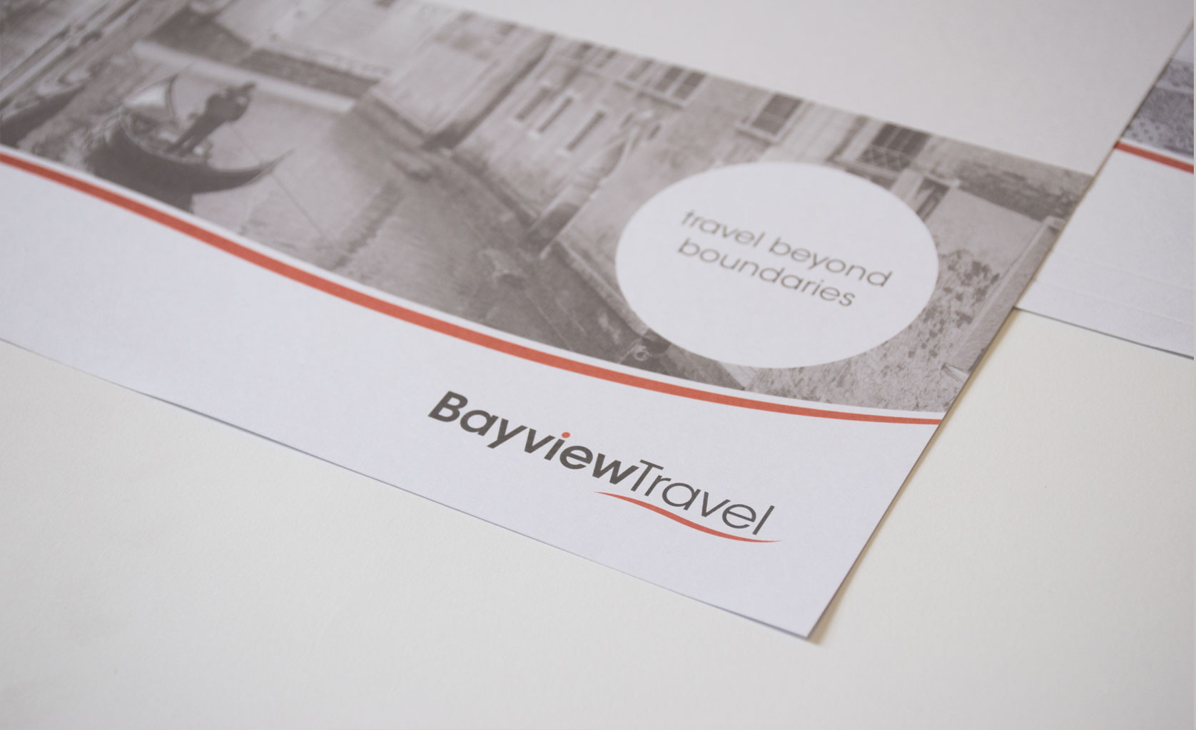
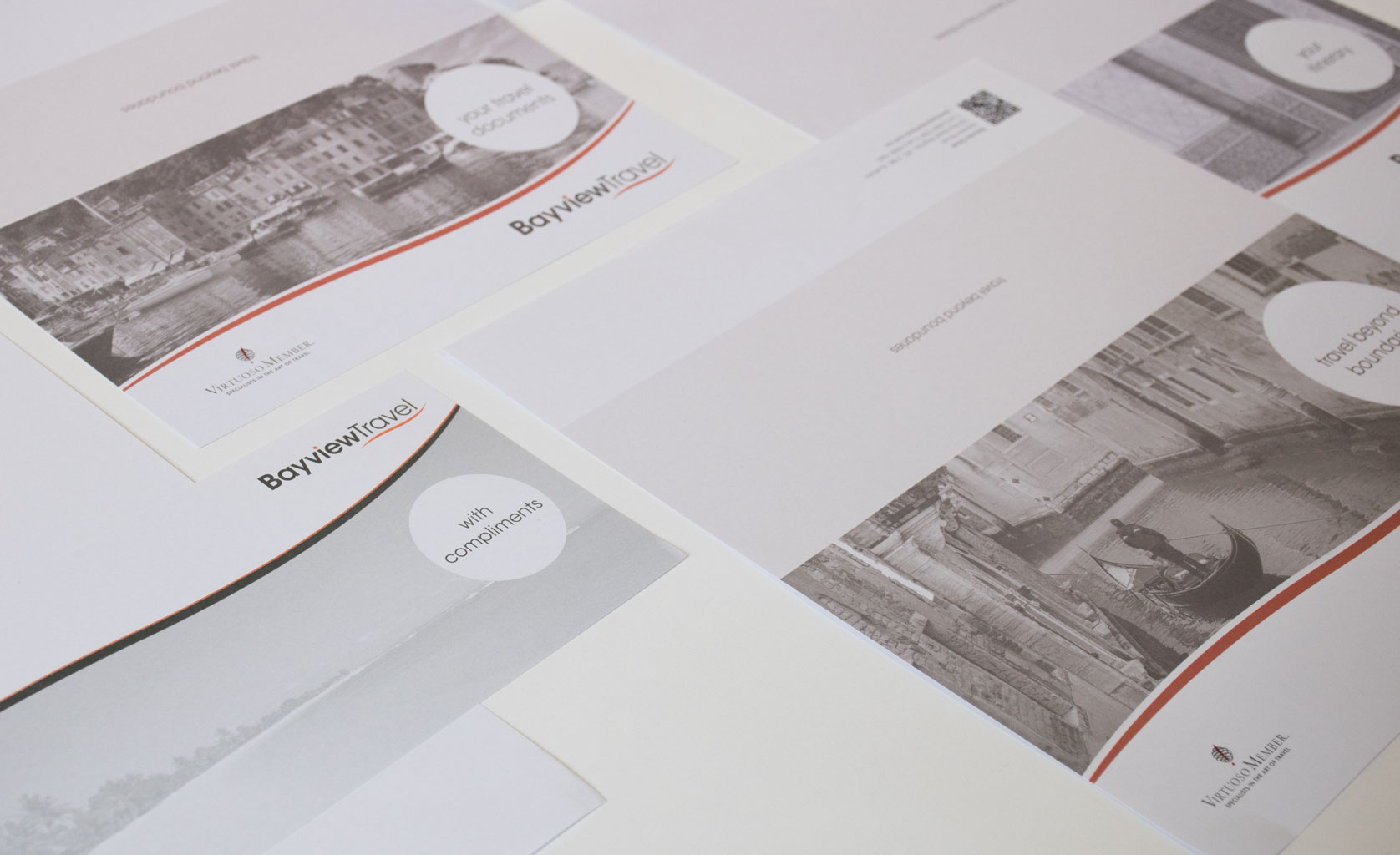
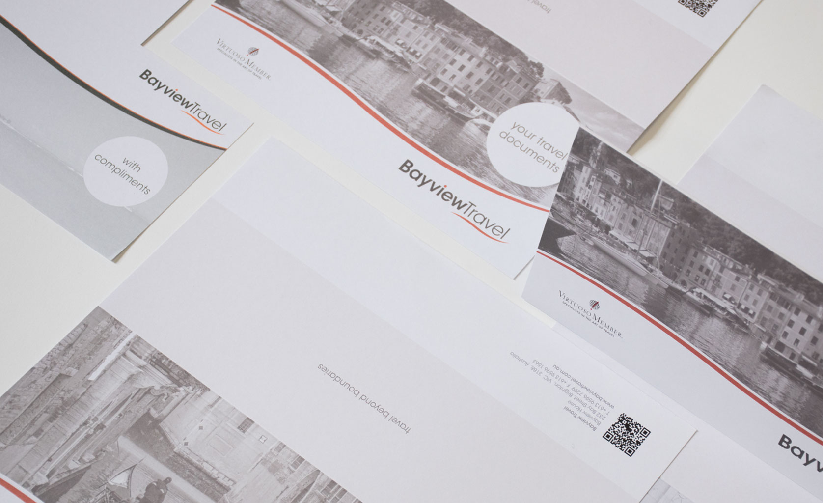
Bayview Travel
Bayview Travel is a luxury travel agency in Brighton, Victoria. They approached Idaho to refine their logo and then develop a wider brand style that would then be applied across a number of collateral.
Challenge
To refine their current logo without changing the brand’s “essence”, and evolve the wider branding into a style that is more in line with luxury than their current style.
Solution
We decided to retain the current logo font and differently coloured dot in the “i” as a link to the previous logo. A new platinum colour and a gestured wave element were introduced amongst other small refinements. A whole suite of materials from document holders, presentation folders, signage, powerpoint presentations and posters were created, using the platinum and wave element to create a brand story that helps communicate their values and sets them apart from their competitors.