
TMOS – Branding
“We love getting to work on a project that encompasses a whole spectrum of branding and materials.”
Alicia Whetton, Senior Designer
Client
TMOS
The Australian Research Council Centre of Excellence for Transformative Meta-Optical Systems (TMOS) will solve fundamental and applied scientific problems by harnessing the disruptive concept of meta-optics – a field pioneered in Australia. TMOS aims to overcome complex challenges in light generation, manipulation and detection at the nanoscale, thereby aligning optics with the advances in nanoelectronics.
Challenge
Idaho was asked to design a brand for a newly created centre of excellence that was flexible enough to be used within range graphical environments without loosing its brand consistency.
Solution
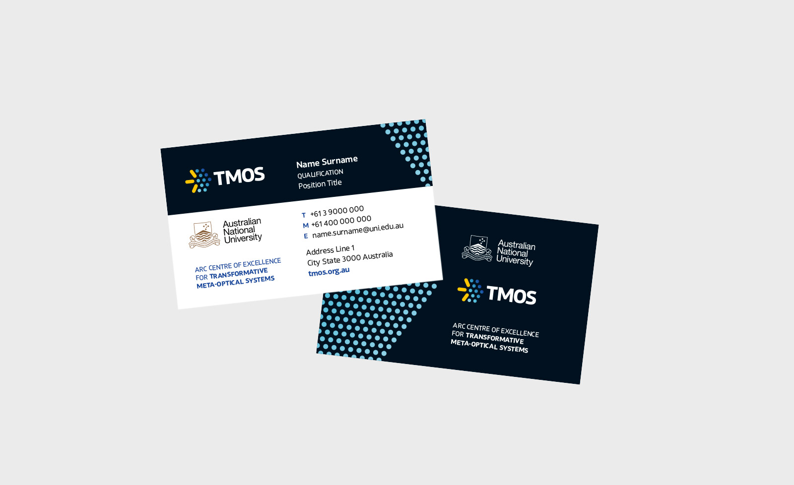
The TMOS logo combines a light source (three lines) and an artificial structured surface (dots). The icon demonstrates the concept of meta-optics and forms an arrow, pointing to the future advancement of optical technology that TMOS will enable.
The simplicity of the design and bold type provide a resilience to the logo structure. The resilience allows the logo colours to be varied and used within a wide colour spectrum without loosing brand consistency.